EarthScan
Discover, analyse and act on the climate risks and opportunities that your assets are facing.

EarthScan is a climate intelligence platform that allows users to understand the physical climate risk to their assets, such as residential buildings, factories, energy infrastructure.
In this page, I will go over a high-level introduction to EarthScan and my role as the lead designer for the past 2 years with highlights from some projects.
For in-depth case study into an ongoing project, please see the EU Taxonomy project.
My role in EarthScan:
As the lead designer for our product EarthScan, I have been leading 2 squads and ensuring that the designs we work on are consistent, holistic and reflective of company’s long-, medium- and short-term goals. At the same time, I am also responsible for delivering features as a squad designer as well, from discovery to high-fidelity designs.
During my time at EarthScan, I have lead multiple high business-priority projects through the overall design process, from initial requirements gathering, facilitating workshops with internal and external SMEs including climate scientists, policy experts and engineers, and testing proof of concepts with users to creating high fidelity designs, and implementation.
For over 2+ years, EarthScan has been using the second version of the design system that I created and maintained.
What is the problem we are trying to solve with EarthScan?
We are all aware of climate change. We know that the temperatures are rising, and that the world is getting hotter. But these impacts are quite abstract and difficult to relate to. How do these hazards from climate change affect my assets? How will it affect my factories, hotels, or the assets that I’m investing in? What actions should I take?
EarthScan allows you to understand how the different climate hazards will impact your assets under different scenarios throughout the time periods. You can discover, analyze and act on the climate risks and opportunities that your assets are facing.
Who are EarthScan users?
Anyone who wants to learn about the climate exposure of their assets can benefit from EarthScan. The first thing any user does is to look up where they live, and then look up where their parents live. However, when we are looking to understand what to build and design next, our primary users are: supply chain managers, asset managers, and ESG analysts.
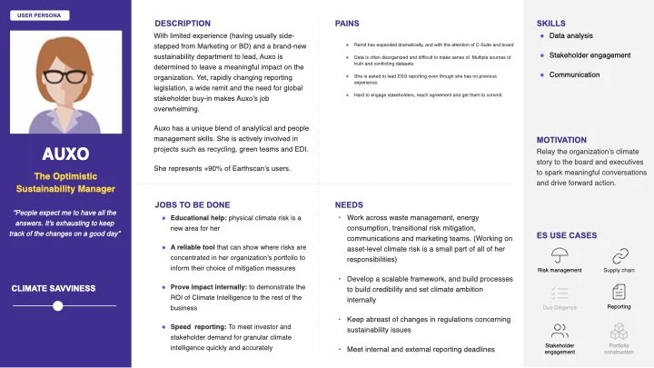
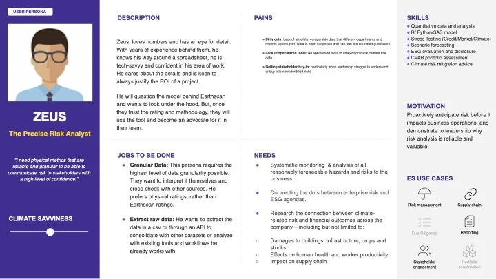
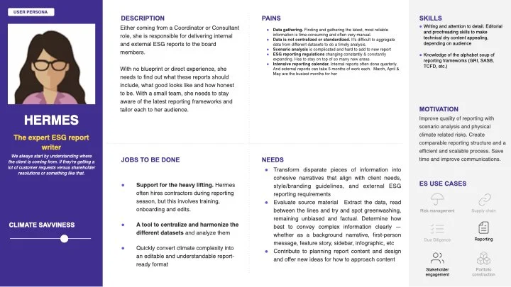
It took a while as we built our personas. Before our user research team joined Cervest, I conducted interviews of our early users, and compiled feedback to start mapping our findings around common pains, which was used to help the user research team build our personas:

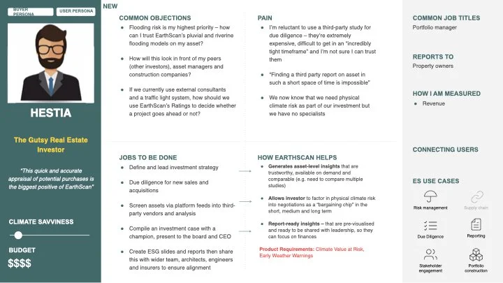
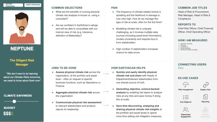
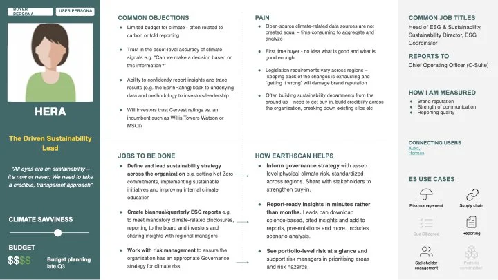
These are some of our personas:
Key user journey
At a high level, the EarthScan user journey can be summarised into the following (after their account is created):
Create a portfolio and upload your assets
2. Access insights & explore how the different climate parameters (eg. scenario, year, risk categories) affect your assets.

3. Access different features needed based on your specific needs such as downloading, comparing, reporting
Below is a 30 second video of the different parameters and insights we designed to help users understand their assets better:
Below are the widgets in detail:


Key features that I worked on
When we first launched 2 years ago, only steps 1 and 2 of the user journey were built. Since then, we have been able to learn from our users to launch new features. I worked very closely with the product leads and the customer success (CS) and user research (UXR) teams to understand the key pain points & needs, in order to prioritise what to build next, and how such work would contribute to the overall company objectives.
The following are a few of the features that I worked closely on.
Insight download (CSV and PNG)
Users are able to download individual insight widgets into images and CSV files.
A lot of people wanted to use the visualisations of our insights for their own internal reporting purposes, such as client meetings or board meetings.
Another thing we learned is that users wanted to take away the data behind each insight as a CSV to do their own analysis, visualisation and create slides.
We have had so far over 700 downloads in the last quarter.
Portfolio segmentation & benchmarking
Users are able to segment their portfolio into different subsets and compare different portfolios to one another.
We learned that users often first dump all their assets into a portfolio and then want to filter and segment their assets into separate subsets.
Following segmentation, users can also compare to other portfolios - not only with their own other portfolios but with benchmark portfolios as well.
The “Compare” page has been visited 51 times, and users have chosen to compare a portfolio through my designs 37 times.

Summary Report
Users can read a summary of highlights from the insights we generate.
Sometimes, users just wanted highlights of where they need to look at before diving into any details, as the number of insights we provide can be overwhelmed. We designed a summary report as something that users can access to obtain a high-level summary and understand which asset or hazard to focus on for a deeper dive.

Improving explainability
Users are provided with additional explanations to improve their understanding and make the rest of the product and insights more accessible.
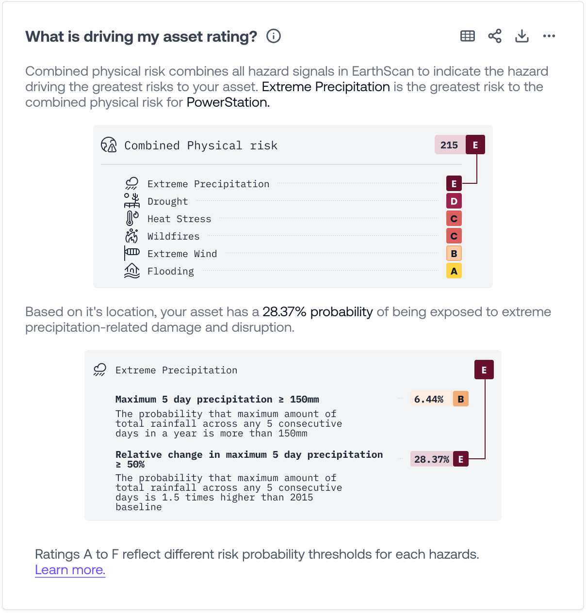
Climate science is a difficult and complicated topic which our users look to us to explain. We identified several touch points in the journey where users ask questions, such as “Why is my combined physical risk rated as A?”, “Is the rise in sea-level related to coastal flooding?”, or “What does return period mean?”. The solutions to answering these user questions can range from as simple as adding a popover on the widget to designing a completely new widget.
Let me dive deeper into the process involved in some of the work mentioned above in more detail.
Example - Improving explainability: Asset decomposition
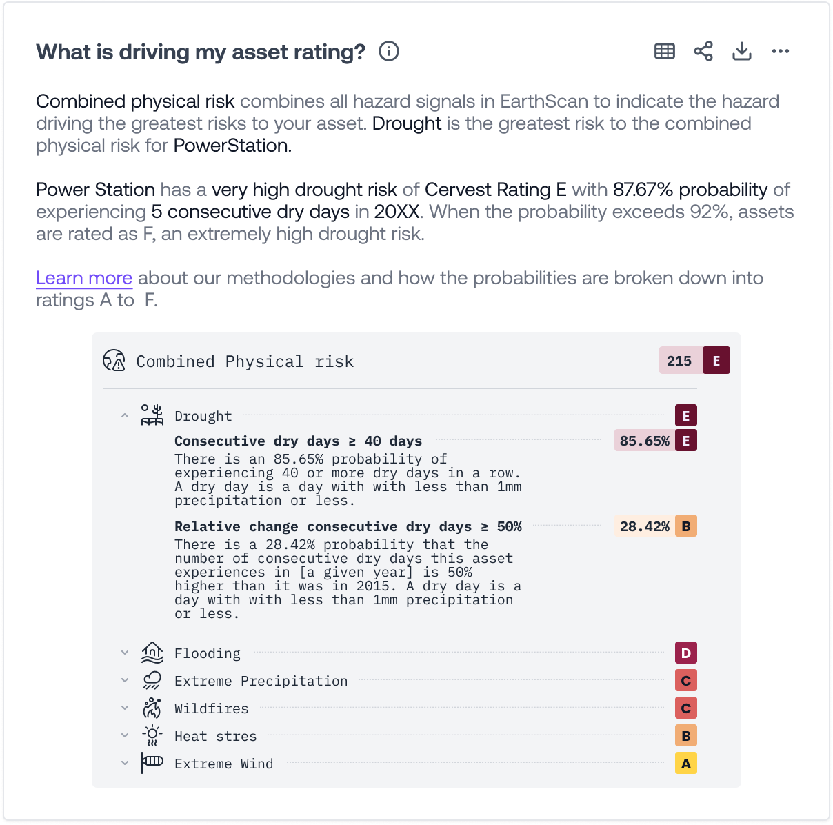
As mentioned above, we found out that users were asking for further information to support the data and insights they were seeing on EarthScan. One of the areas we often heard was that users were struggling to understand why they got a given rating for a given hazard. For example, when users saw that their combined physical risk for their home was a D, they wanted to learn more about why this was the case. “The Earthscan tool is fairly easy to understand and has all the contextual information needed to grasp the meaning behind different ratings. One piece of feedback is to include descriptors for the different ratings within the graphics – rather than seeing the descriptions below or off to the side.“
In order to understand this problem space better, I lead a discovery phase involving the UXR, CS & Product teams, as well as the scientists behind our ratings methodology. I kicked off the discovery phase by working with UXR and CS to understand what users were saying, how the CS team has answered the questions so far and the user responses. Then I reached out to our science team to do a deep dive into their methodology which involved learning a lot about the different metrics, methods and probability thresholds that they were using. This was important as my job as a designer was to breakdown the complex methodology into something that is easy to understand while still being scientifically accurate.
The Discovery process was a constant back and forth with the stakeholders, iterating from rough sketches with a lot of unanswered questions through to refined high fidelity designs which were ready to test. Below are a few snippets of the many workshops I facilitated.


After multiple iterations, we ended up with 3 designs to test, each of which had its pros and cons.
In order to explain what each of the designs were being tested against, I will give a brief explanation to how our ratings methodology works:
The combined physical risk is basically the rating of the hazard that poses the greatest risk to the asset.
So if a given asset has Heat Stress as its highest risk, the combined physical risk will be the rating of the Heat Stress.
However, we have a secondary level to explain here which is, then why is my Heat Stress rating an “E”?
A hazard’s rating is determined by whichever metric under that hazard (eg. number of heatwave days, maximum temperature) that has the highest rating.
Ultimately, each metric rating is based on the probability of the metric happening. For example, if there is X% probability of your asset experiencing 12 days of heatwave, your asset’s rating is Y.
This version was design to provide not only ratings for all hazards but also the metrics for the hazard that drove the overall Combined rating.

This version was a simpler version aimed at providing information about only the hazard and metric which drove the overall Combined rating.

This version was an all-inclusive design where you could get information on both the ratings and and the metrics for all hazards.
Findings from our testing were following:
Users loved the design with all of the information as it gave a full explanation on the hazards. This is particularly useful in cases where, for example, drought may pose the highest risk to a given asset, but based on the business, the user might care more about flooding.
Users wanted to understand the different probability buckets for each rating, which is why we brought the explanation of the underlying metrics closer.
With the new designs, although users were able to understand that the hazard with the worst rating drove the rating for the Combined Physical risk, the fact that this is called the “Combined” physical risk was confusing. As a result, we then escalated this to Product and Science so they could review the phrase.
Currently, we are waiting for Backend to finish prepping the backend system to receive the new hazard metrics. While I do not yet have metrics to support the success of this widget, it’s worth noting that the widget I designed through a similar design process was the 2nd most downloaded widget since its launch.
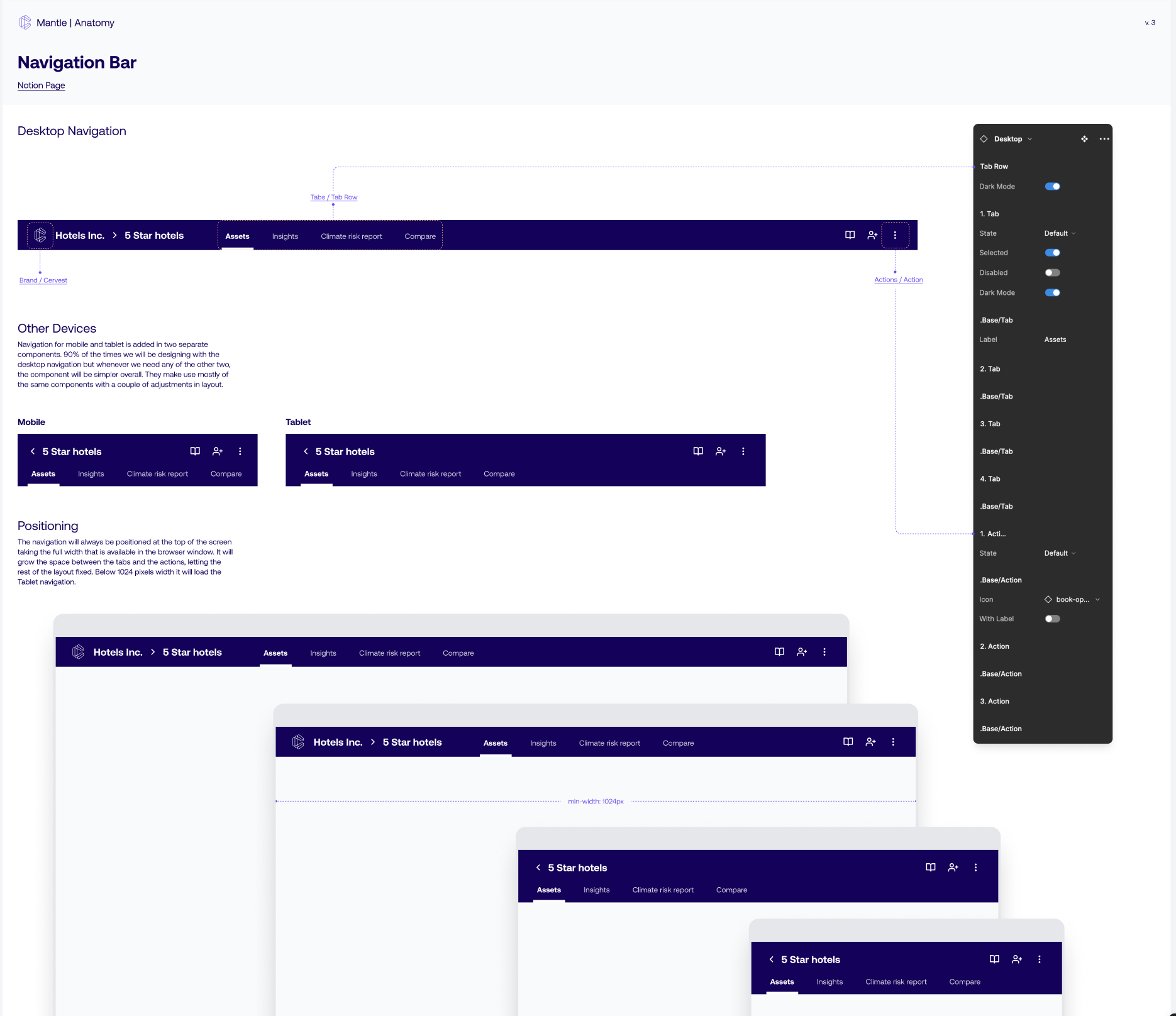
Design system
At Cervest, our design system Mantle has been through a lot of changes. I have been leading the execution and building of our design system to ensure consistency throughout the product. While I can’t share details of how we are building our design system, please find snippets of the WIP below: