
Bus Open Data
Making data open and available

The Bus Open Data Service (BODS) is an open-source platform that allows:
Operators to publish their routes and timetable data; and
Data consumers to gain high-quality data which they can use for their business, research, or any other purposes.
I have been working with the Department for Transport to support the Secretary of State’s vision of making Britain the best place in the world to do transport digitally. The Bus Services Act (2017) states that by 2020, it is required for bus operators to open up data for local bus services across England, including information routes and timetables; fares and tickets; and real-time information. As a designer on the team, my focus was on making the experience of publishing data easy whilst ensuring high quality, as well as making it easy for consumers to find what they need.
Live website:
Publisher: https://publish.bus-data.dft.gov.uk
Developer: https://data.bus-data.dft.gov.uk
Publisher requires log in so might not be as exciting but explore the data consumer experience!
Overview
From 2018 June to December, the KPMG Design team worked with the Department for Transportation to develop the alpha version of the Bus Open Data Service (BODS). In July 2019, I joined the project team as a senior product designer to work on the private beta version of BODS. The scope of this private beta phase included refining the screens involved in the data publishing flow and finding data flow.
My role
As a senior product designer on the team, I was involved hands-on in leading user research, designing screens, conducting user testing and enabling a successful Government Digital Services (GDS) assessment .
Here are some of the key duties I performed during the project:
Created a styleguide of the GDS Design system for Sketch using Sketch nesting symbols.
Created personas by leading workshops & refinements.
User workshops
Brainstormed ways to best facilitate 10+ people workshops with the lead designer.
Prepped the presentations & two versions of the workbook for different sessions.
Facilitated multiple all-day workshops.
UX Research
Wrote up the questionnaire for initial interviews to identify problem area.
Prepared materials for user testing.
Conducted user testing on the designs for multiple flows including file upload, data quality check, accounts, and more.
Designs
Organised and held ideation sessions with stakeholders on designs.
Updated designs from the alpha phase to match the current GDS design system.
Researched current sites such as those for visa applications and vehicle registration in order to understand the different interfaces which might be applicable to BODS.
Created the UX and UI for data quality, conducted multiple user tests and iterated.
Consistent communication with the lead designer throughout the process in order to ideate together and keep them in the loop.
Worked back and forth with BAs, providing them with designs and refining these based on the user stories.
GDS assessment
Helped the lead designer prep for the assessment by compiling all of the design iterations and communicated the rationale behind each change.
Project challenge and approach
Challenge
KPMG was invited to work with the Department for Transport (DfT) to tackle the decline in bus travel. DfT had identified an opportunity to provide and utilise open data in transport, in order to make improvements for bus users. In 2017 the Bus Services Act 2017: Bus Open Data was released, which legally required all bus operators to open their data by 2020. This Act required a digital platform for users to access and interactive with.
Approach
Using human-centred design approach, the design team interviewed over 40 user and industry SME interviews to map out key journeys, pain points and opportunities. The themes were used to shape the new digital service, content and assisted digital strategy, information architecture, UX strategy and more. The service was continually tested by the intended users and designs were updated to assure that the solution was easy to use, relevance and accessibility. Working in an agile environment, designs and prototype to incrementally improve the users’ experience.
Outcome
Working with industry leading transport data experts, the team delivered a cutting edge GOV.UK service that answered key user needs and enabled all users to share their data sets. Following several rigorous Government Digital Service assessments, the Bus Open Data Digital Service went live in early 2020. The Department for Transport is now able to work with technology companies and information providers to ensure that a range of innovative products are designed to make the most of the data and help all bus users make informed choices.
Bus industry background
In England, there are 33,900 buses performing 4.32 billion journeys each year. The need for open data in the bus industry follows:

The industry is made up of multiple stakeholders that work with each other, both directly and indirectly.

Research & Findings
User research was mainly done for two categories of user group: Operators and Data Consumers, although secondary stakeholders, such as local authorities, 3rd party tech providers, and DfT implementation managers, were also kept in mind.
Operators
One of the unique aspect of this project was that we were designing a new way of working for the operators, rather than improving the current system. With the new regulations to provide data digitally, all operators were forced to comply. Because of this, our initial user research was centred around understanding what their current day-to-day job looked like, how their data is structured, and what information needed to be captured by the platform, as well as making the process as easy as possible for the operators, since they will be the publishers of the data.
We conducted 1:1 interviews with 7 large, medium and small operators.
Key findings were as follows:
Large operators had their own tools and systems of how to produce timetable data. They were worried that the new platform would not integrate with their system.
Small & Medium operators were not familiar with concept of “data”, and the tool they used was Excel.
Publishing data on BODS would be another task for operators, and for small operators, this requires time and money.
There are many different variations of the same bus timetable: Weekdays, school days, weekends, bank holidays, etc. The tool had to be able to capture this different information.
Bus routes are regularly updated, and therefore the data have to be too.
All operators had concerns on data quality.
Data consumers
Data consumers can be split into three categories: Developers/entrepreneurs, researchers, data aggregators.

Key findings were as follows:
They needed to be able to find data based on location, bus number, etc.
Some needed only one data file, while some needed everything.
It was important to be able to access the historical data for any given route, not just the most up-to-date data.
Data consumers wanted to be able to access data both as a raw TxC file as well as via an API query.
The quality of the data was very important.
Persona
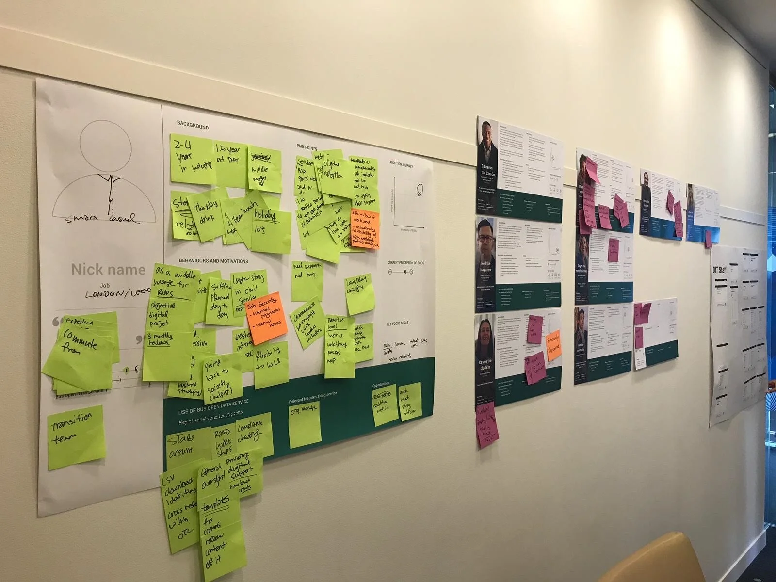
With the research we conducted, we were able to create personas for the different user types we identified. We held co-creation workshops and persona validation sessions with the DfT stakeholders as well as an implementation groups consisting of a group of industry professionals, all of whom joined to give input to the new policy design and to evaluate the progress of open data initiative.
Before we jump into the personas, it is important to mention that in creating personas for the public sector, we had different aspects to consider compared to usual, the most important of which was the Digital Inclusion Scale. Often as designers, we are exposed to users who are already familiar with technology. However, designing for public meant we had to understand and design for the whole population, including those are reluctant to use technology. To reflect this, each persona also has a Digital Inclusion Scale rating.
Operators

Una the Uninformed
Una is a small bus operator, who tend to operate mostly in rural areas. Una’s business is a family business, and therefore Una is both time- and resource-poor. While she has heard about the changes coming to bus operators regarding open data, she hasn’t been informed in timely manner and is unsure of the changes it might bring. This is important as she is also not the most tech savvy of individuals, and will need help around uploading data.

Cameron the Can-do
Cameron works for a medium-sized bus operator and has been in the industry for about a decade. While he is motivated to provide top-quality data to the public, his process for checking the quality is manual. He is concerned about the new policy on open data as it seems to require a change in his company’s operating model, such as hosting the data.

Warren the Wary
Warren is an influential industry expert who also works for one of the largest bus operators in the UK. He is very aware of the new policy guidelines as he was invited to be part of the BODS implementation group, where they discuss the progression of policy development.
He often works with advanced technologies, and is repulsed by the changes required by the new policies. This is because the operator already possesses mature operating models, which will need to take a step back in order to work with the slower paced public systems.
Data Consumers

Dayna the Detail-oriented
Dayna is an experienced app developer, who has been working in the transport industry for the past 2 years. When using open data, her main concern is around the quality of the data as it will have a huge affect on the final product.
She also needs the data set to be accessible and searchable through different criteria.

Ian the Innovator
Ian is a PhD researcher studying the correlation between the climate change and transportation data. As a researcher, his interests are around the historical data which he can use for analyses and predictions. As a non-technical person, he also requires instructions on using and finding the data.

Chris the Concerned
Chris is a transport data aggregator who is highly influential in the industry. He is also a part of the BODS implementation group and his opinions are respected by the policy makers. He has concerns around the quality of the data and the direction the industry is going. Additionally, as a transport data aggregation company owner, he is concerned about how the new policies might affect his business.
Secondary Personas
Henry the Hesitant (Local Authority)

Iris the implementor (DfT Project Lead)

Tim the Techy (Tech Suppliers)

Olivia the Opportunist (Freelance Consultant)

Identifying key flows
With the personas in mind, we identified key flows and features for both operators and data consumers.
Operators:
Publishing data
Uploading bus data via file upload or API
Data Quality check (Feature where the tool itself provides data quality checks on different aspects such as correct stop names, times and etc)
Review & Publish
Updating data sets
Uploading bus data via file upload or API
Data Quality check
Review & Publish
Managing data sets
Ability to view status of datasets
Managing accounts
Team lead accounts
Team member accounts
Data consumers
Finding data
Browse catalog
Search for a specific data set
Download all data sets
Pull from API
Subscribing to a data set
Providing feedback on a data set
Account management
See subscribed data sets
Design
Before we started designing, it was important that we establish a design system that can be easily used on Sketch. This is not only beneficial to designers but was important when collaborating with engineers.
I utilised the symbol nesting in Sketch to maintain a clean and simple design workflow.

Designs & Flows
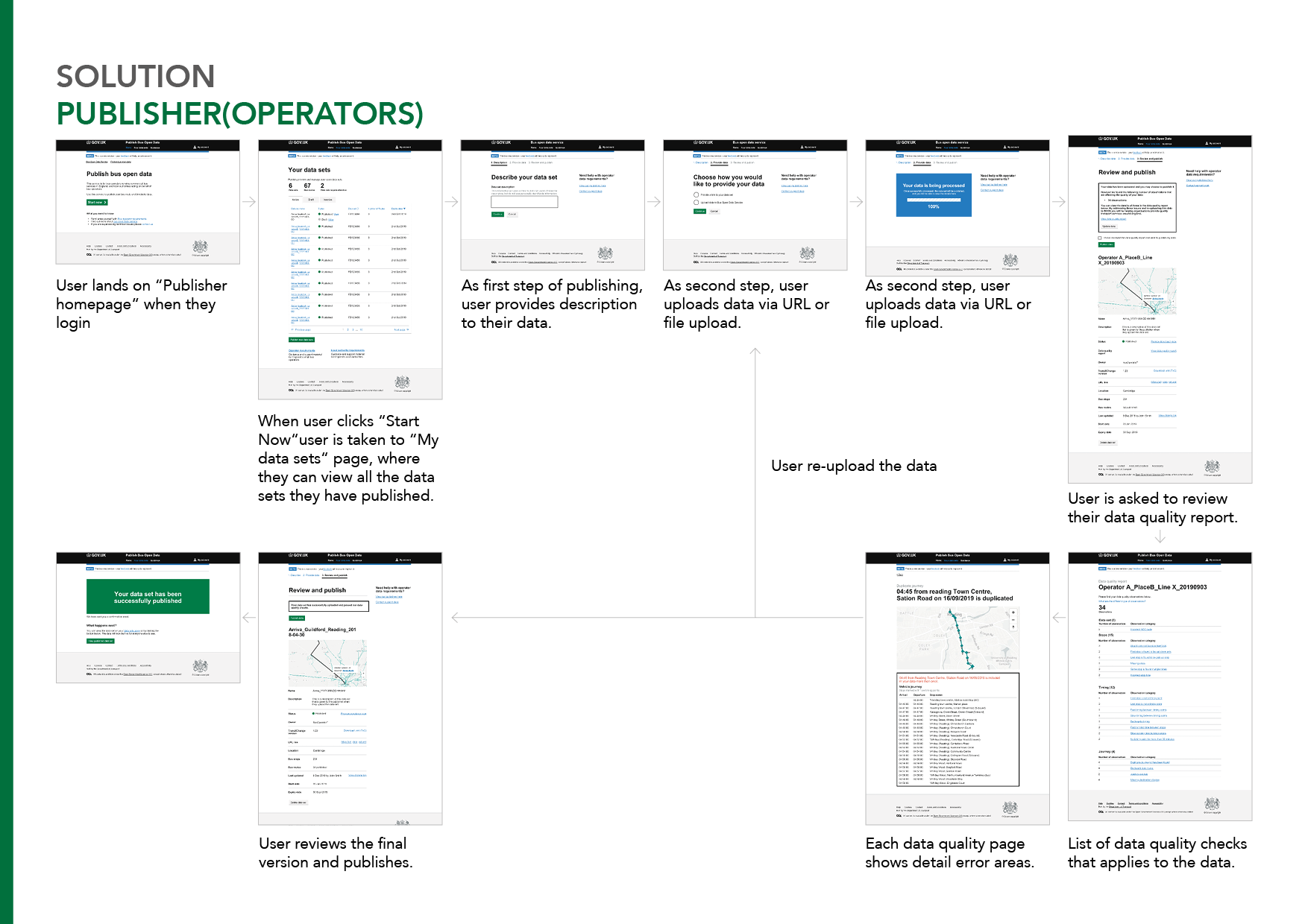
Challenges we faced while designing the publisher flow:
Working around technical limitations which were not identified beforehand was one of the challenges. Originally, we did not have a review page as our understanding was that the data would be processed immediately and users would be able to see the upload. However, over the time, we learned that once the user uploads the data (via file upload or via the API), it takes 1-3 hours to check the content for data quality. We had to constantly update the design and the user flow to accommodate these limitations.
While we want to have the data at the best quality possible, the policy is about uploading the data. This means that the operators have fulfilled their obligations simply by uploading their data. We needed to design the page/flow such that, while we would not force them to re-upload with better data if the quality was low, we wanted to nudge users to make sure they checked the quality and re-uploaded if necessary after our data quality check. More content on this challenge can be found in the user testing section below.

Challenges we faced while designing the data consumer flow:
Through user research, we identified that there were 4 quite distinctive user needs around finding the data. This wasn’t clear in the beginning so the design went through multiple iterations of the homepage, trying to navigate different users into different pathways.
The pages on Data set details went through several different iterations to accommodate the different information users wanted to see based on whether they were engineers, researchers or a data aggregator.
User testing & Iterations
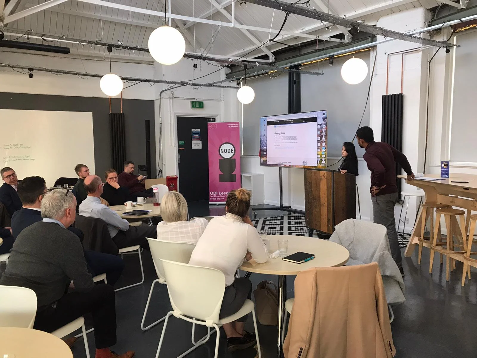
We had 1:1 testings (10+) as well as a group session with both consumers and operators.


Key flows that were tested, the findings and the changes to designs:
Publishing and nudging users for quality check
As mentioned above in the challenges, here it was important to design a page that nudges the operator to re-upload higher-quality data, while not forcing them or discarding the current upload. On the left is one of our original designs, where we did not have a review page. This meant that users would be shown the results of the data quality check after publishing was done, rather than before. In addition, the wording of “Passed” suggested to users that they were finished, even if there were issues flagged by the data quality check. This lead to most operators not actually reading through the data quality report.
As a result, we updated this by adding a Review & Publish step, including a check box to confirm that the data quality report has been reviewed and that the data quality was good. This was perceived better, and lead to every operator wanting to look through the data quality report.

Stepper
The left design was done during the alpha phase, prior to my involvement. The design was not only outdated, but also made it difficult for users to know where they were in the process. It did not showcase what step the user was in, or how many more steps user needed to complete. The updated design clearly showcases where they are in the process, and uses an updated style from the GDS design system.

Tab VS List
This is the page operators see when they click “View data quality report“ from their data set review page, prior to publishing. We tested 2 different designs: Tab view and List view. While both designs had pros and cons, users responded better to the list view, where they could see all of the different issues on one page rather than clicking through the tabs.

Data Quality Scroll
This page is the “data quality report detail” page, i.e. the page users land on when they click on an item/issue from the “View data quality report” page. We tested how users would like to see the list of data points (typically the bus stops and times on a given route). The users resonated better without the scroll as they could find the highlighted bits easier, even though the page could get much longer.

Communicating sample vehicle journey
Designing the right UI/UX for the sample vehicle journey is something we struggled quite a bit with. The sample vehicle journey is an example of previously uploaded data which shares the same timing pattern as the newly uploaded data, but does not exhibit the same data quality issues. These are provided for the user when examining a data quality issue as a reference for how to avoid or fix the issue in the newly uploaded data.
However, the phrasing of the first design caused significant confusion for users. The final design resulted after 3-4 iterations.

Curating pathways for different data consumers
This page was effectively a homepage for the data consumers, where they start searching for a data set. The left design was done during the alpha-phase, prior to my involvement. The old design gives only a search option for finding a journey, while we found out that there are 4 different ways for how a user might find the data set they need:
Browse catalog
Search for a specific data set
Download all data sets
Pull from API
I updated the design to allow users to navigate through the different pathways, and user-tested them with different user groups as mentioned in the persona. Different personas found each of the options useful.
Prototypes
Coming soon! But if you can’t wait, check out the live website:
Publisher: https://publish.bus-data.dft.gov.uk
Developer: https://data.bus-data.dft.gov.uk
Publisher requires log in so might not be as exciting but explore the data consumer experience!